Overview
An app for ordering food specifically for Indian movie theaters is called Screen Bites. This mobile app makes it simple for customers to order food from their seat and examine the menu. They are no longer concerned about waiting in line or having to decide between lunch and a movie. They have the option of picking it up or having it delivered to their seat after paying via the app.
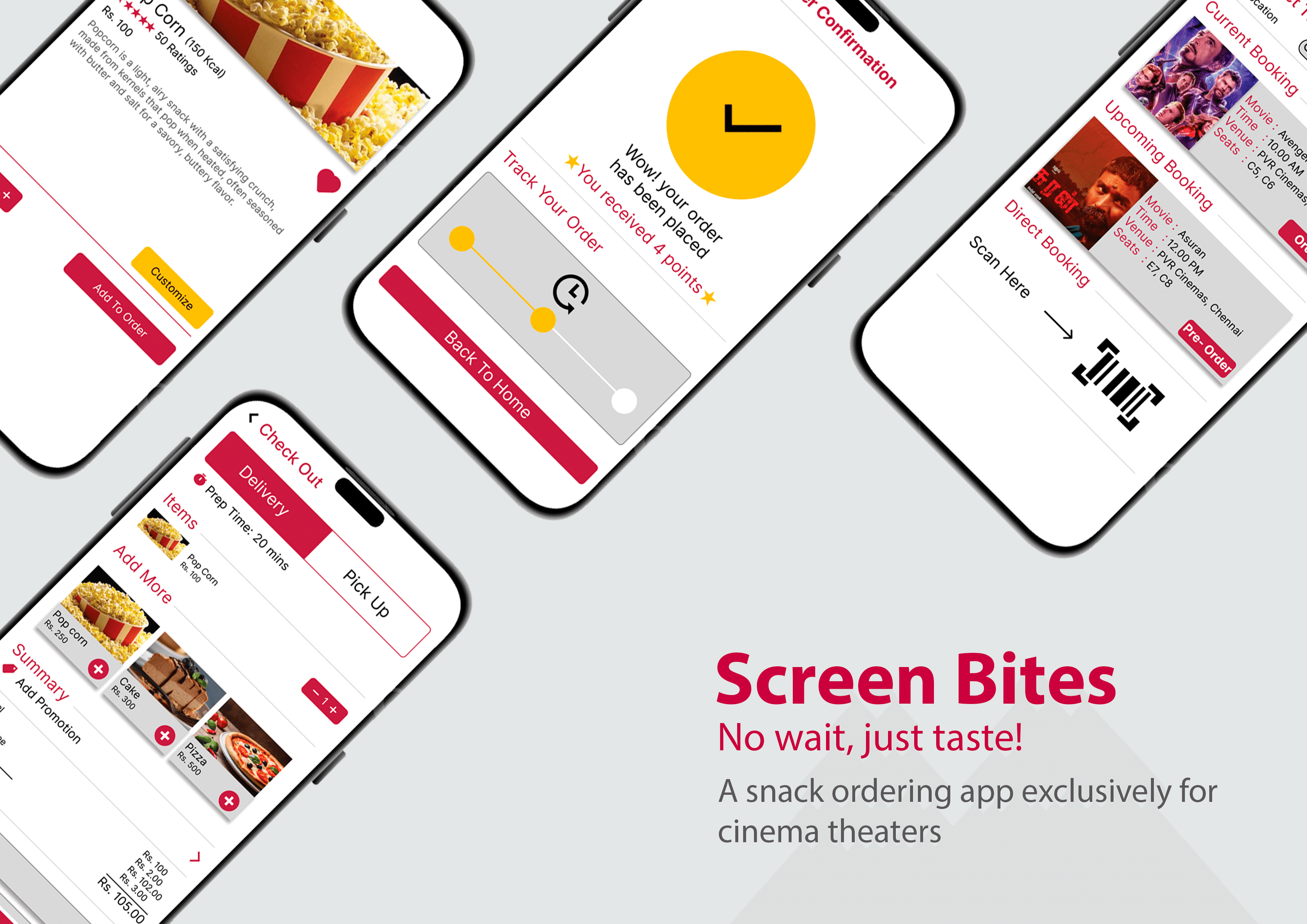
Project Type: App Design
Project Duration: Jan 2023 - Mar 2023
Role: UX Researcher and Designer
Responsibilities
User interviewing, wireframing on paper and digitally, low-fidelity and high-fidelity prototyping, usability testing, taking accessibility into consideration, iterating designs, figuring out information architecture, and responsive design.
The Challenge
People like actors and go to theaters to see their flicks; therefore, movies are always a huge thing. Theaters are constantly packed, especially on weekends and in the initial days after a film's debut. In addition to their love of movies, people also like to eat while watching them. Long lines form at the food counters because, according to research, many theaters profitably offer food. People are frequently forced to choose between seeing a movie or eating because of the crowd.
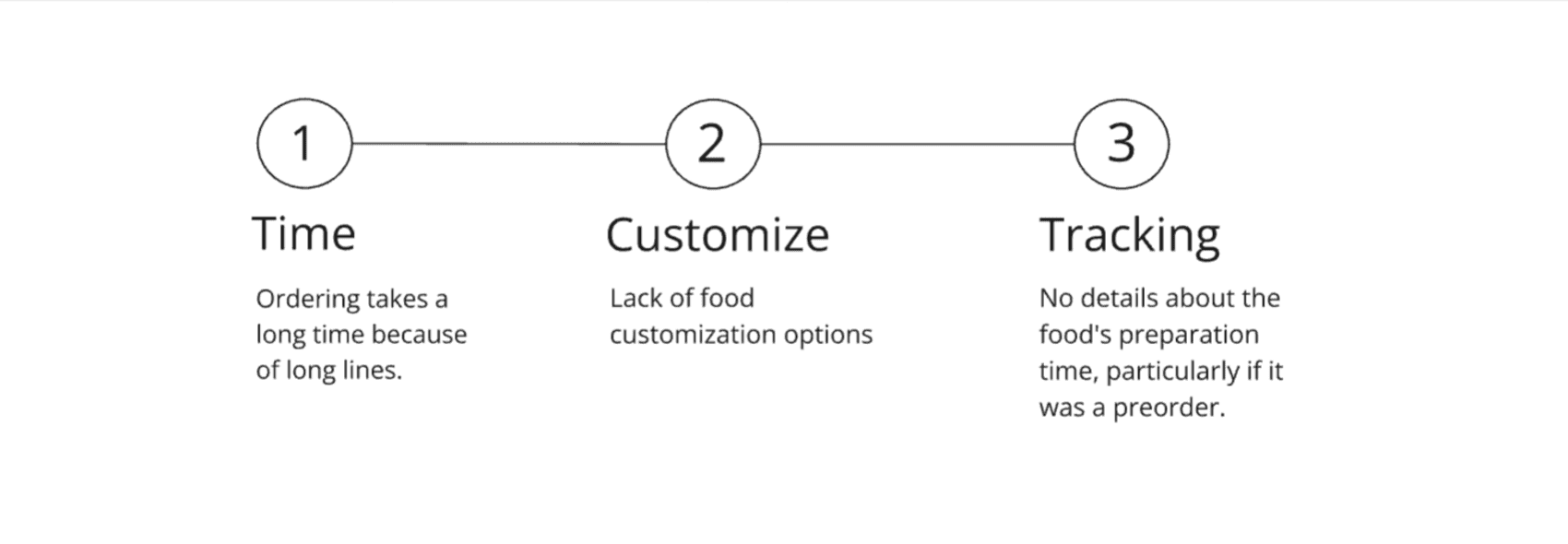
User Pain Points
User Research: Interviews
To learn more about the target clients and their needs, I made empathy maps and performed four user interviews. Students and families were the intended users.
The participants main conclusions were:
When the target users came in as a group, they found it annoying to have to write down several orders. When they have personalization as well, it becomes more difficult.
Having to wait in line to place their orders and then pick up their food irritates the users.
Due to the inability to track preordered meals, users are forced to accept cold food when they pick it up.
Competitive Analysis: Summary
Using the user requirements and pain points from my preliminary research, I examined Snack Break's competitors.
Competitors don't have a specific app for getting theater snacks.
Most of the apps have preorder option followed by either pick-up or delivery during the show, leaving users with limited options.
Customizing the food is not possible with the apps.
They don't provide any motivation to retain users over time.
Their accessibility features are minimal.
User Persona: Raajesh
Raajesh is a project manager who needs an easier, stress-free way to order food during a movie because he wants to watch the entire movie with his family without having to compromise on food.
User Journey Map
Created a user journey map of Raajesh to experience using the site to help identify possible pain points and improvement opportunities.
Storyboarding: Overview
After developing personas, I drew storyboards for one of them to help explore and imagine how the user would interact with the app.

Design Process
User Flow
Started my design process by developing a user flow following user research and the identification of user pain points. Here, I wanted to make logical decisions that would enhance the overall usability of the app.
Paper Wireframe
To address user pain points, the parts that made it to the digital wireframe were sorted and refined through several iterations on paper.

Digital Wireframe
As we moved on to the following stage, I converted paper wireframes to digital and ensured that the design took user research findings into consideration.
Lo-Fidelity Prototype
In order to use the digital wireframes for usability research with users, I made a low-fidelity prototype that connected the main user flow of reading the menu and placing an order for food.
Usability Testing
Performed usability tests twice. The results of the first study were the inspiration for the designs, which consisted of wireframes to mockups. Utilizing a high-fidelity prototype, the second research helped in further refining the mockups to meet user requirements.

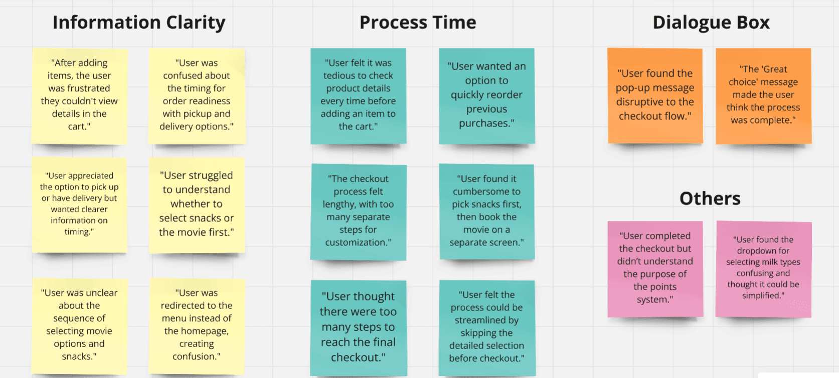
Affinity Mapping
To identify a pattern and common themes, the usability testing has been collected.
Usability Study: Round 1 Findings
Improved my mockups and identified the most critical pain areas to solve after organizing the observations into common themes.
Customers thought the ordering procedure took too long.
Users questioned whether they were also purchasing tickets when they had to select the movie after placing their food order.
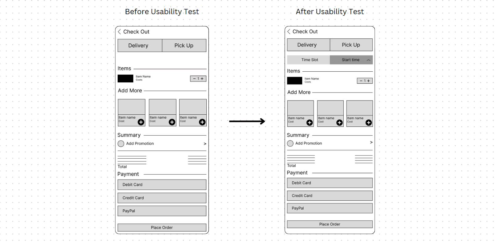
In the event of a preorder, not much information was provided regarding pickup or delivery. No way to choose a certain time, and customers didn't know when the food would be ready.
Enhancing the Design
Mockups
Users stated discomfort with the lengthy process and confusion with the ticket selection choice following the food selection during the usability research. I made changes to the ticket page where the information is loaded according to their reservation, and I also consolidated the process duration.
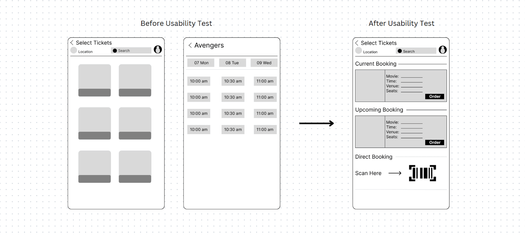
Information Clarity
Preorder pickup and delivery choices were included in the initial designs, but following usability research, I included specific scheduling options for users to choose from when they receive their food. When the preparations start, they can follow the order on the day of the movie because of the order confirmation page.
Usability Study: Round 2 Findings
Based on the findings of the first usability study, I conducted a second usability study for the high-fidelity prototype. These were the study's conclusions:
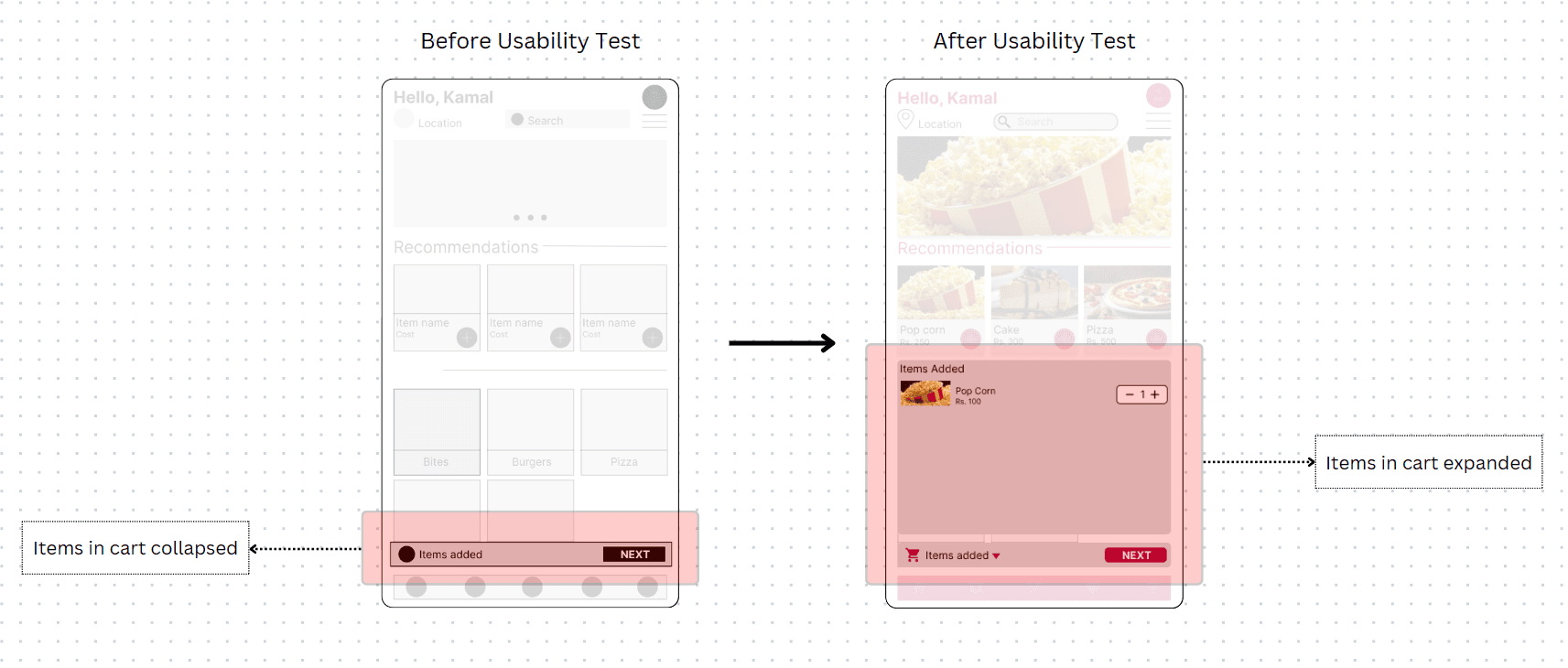
The add-to-cart information is not very important.
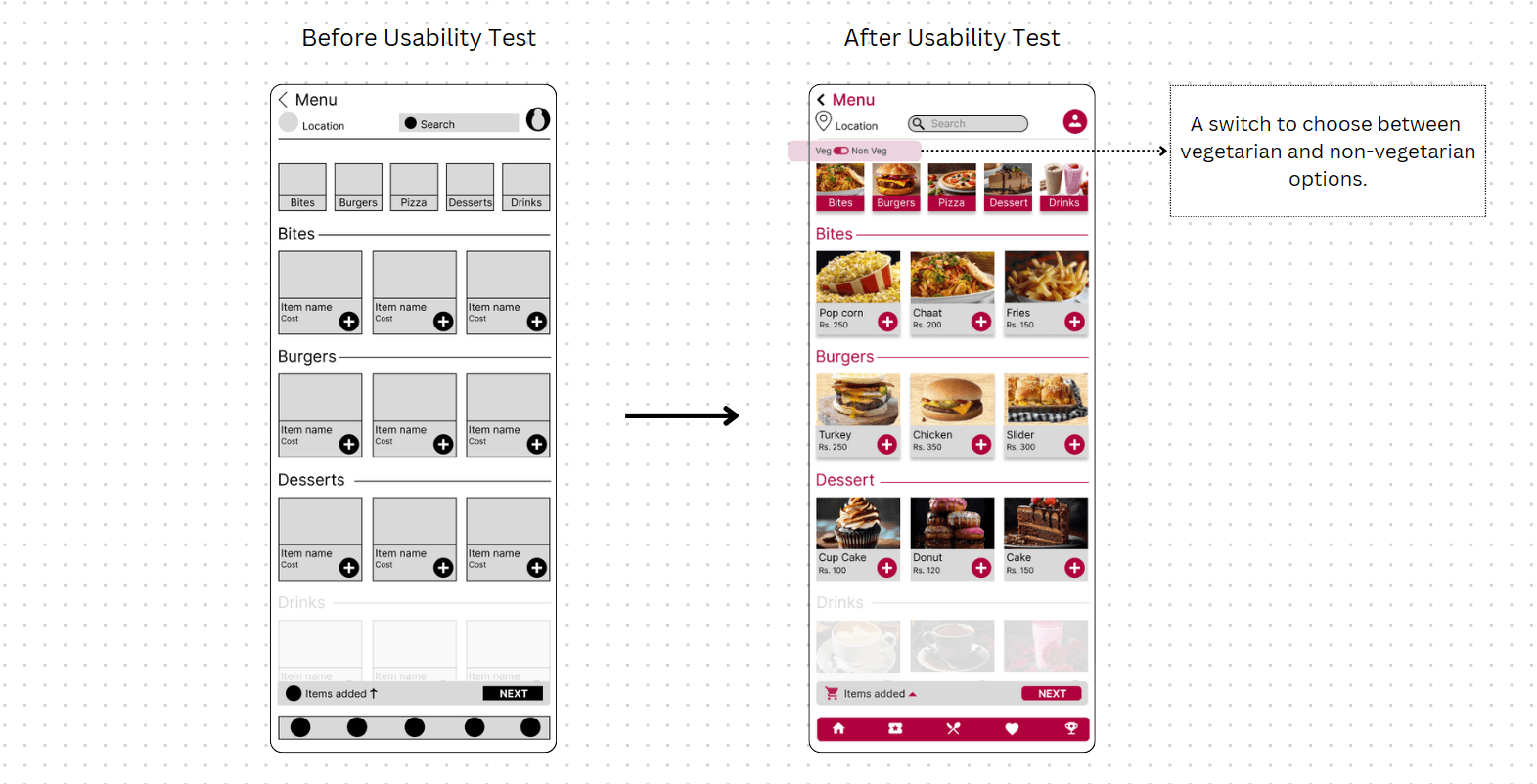
Users didn't see the need for a distinct filter for vegetarians and non-vegetarians.
Hi Fidelity UI Design
Following usability research and design modifications to better meet the needs of users, I began working on the wireframes' visual components. Both growth and exploration components are included in the design.
Color Palette
The color scheme of Screen Bite features clear, attractive, and striking colors. The color scheme also mirrors the aesthetics of movies, making the app relevant to consumers.

Typography
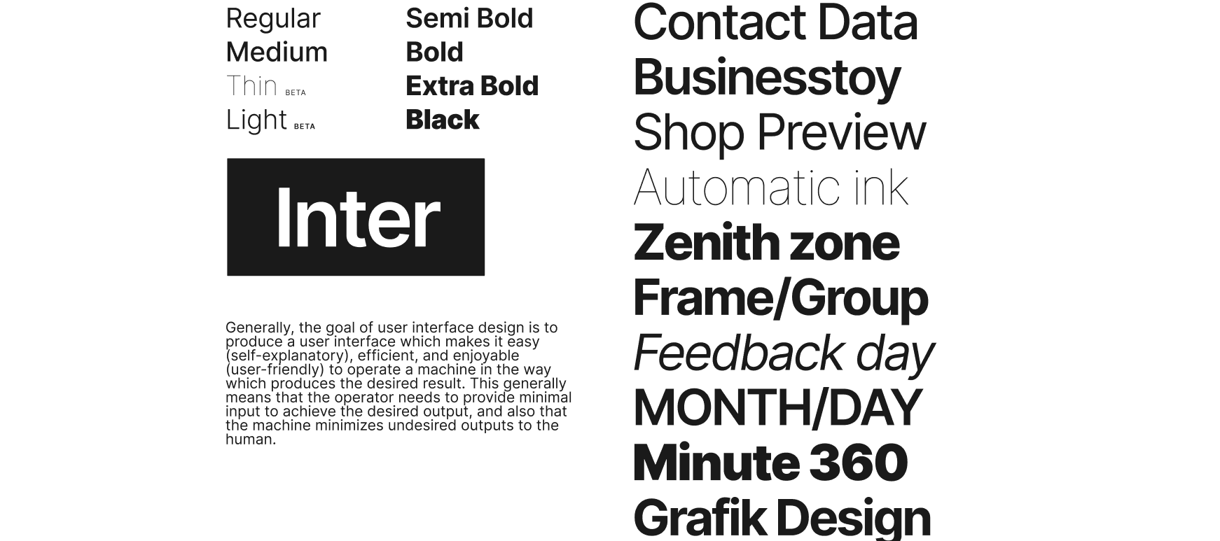
Screen Bite's type scale provides the typographic variety essential for the app's content. All items in the type scale use Inter as the typeface, utilizing its range of weights, including Regular, Medium, and Bold, to create clear visual hierarchy and readability throughout the app.
Iconography
Screen Bite's icons were picked from the Google Material library such that they reflect the brand's aesthetics.
Buttons

High Fidelity Mockups
Primary User Flow: Order during movie
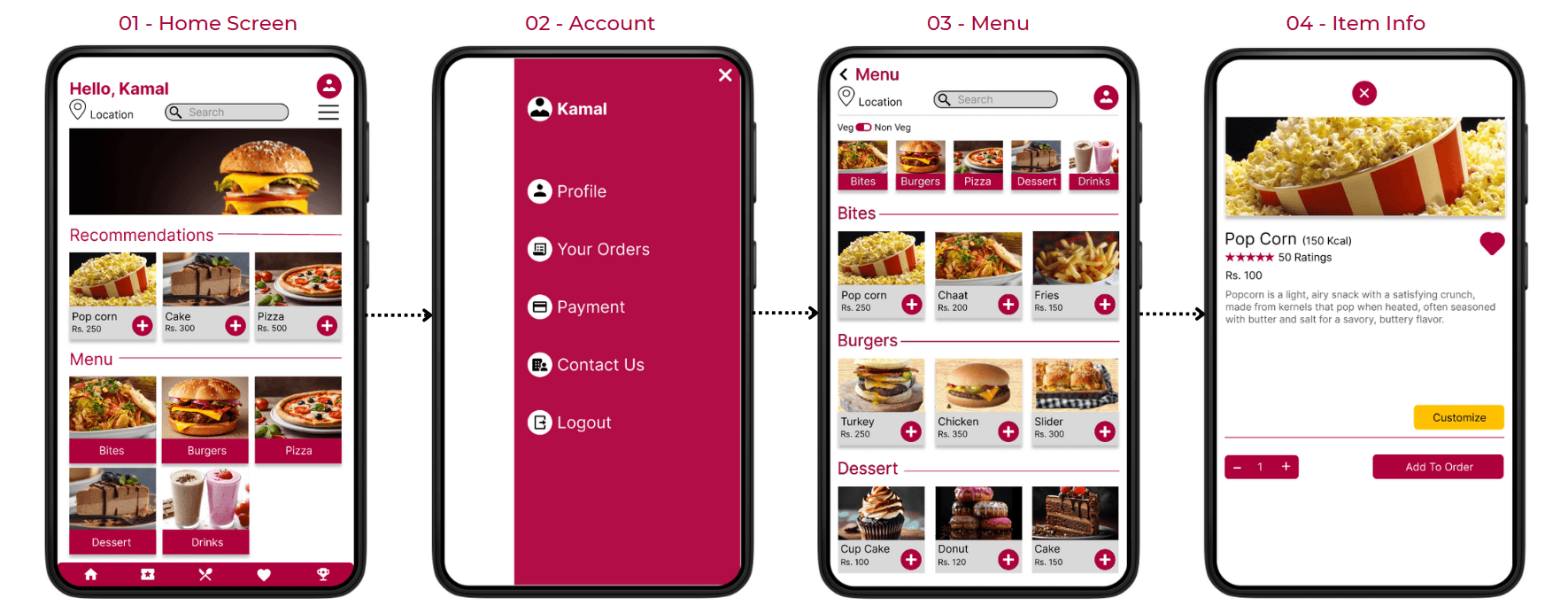
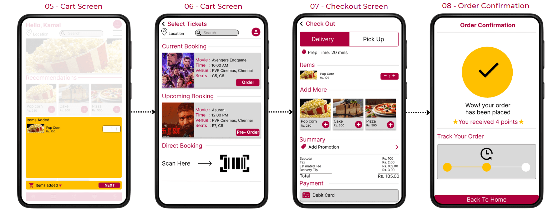
Mockups for Preorder pickup/delivery
Pick-up and delivery options are available for food preorders. Both provide exact time selection to improve the clarity of the food processing and preparation.
Accessibility Features
The contrast ratio of the app met the requirements for WCAG 2.1 Level AA accessibility.
To help people understand the design, images and text were added together.

Moving Forward
Impact
The app really helps users skip the entire traditional ordering process in theaters and instead meet all their needs from their seat.
What I learned
I learned how important it was to understand the user when working on the design. User research was the source of every design change. When they had the opportunity to use the product, this was further expanded through usability research. It definitely contributed to improving the design.


