Mastering Emphasis in Mockups: A Guide to Catching User Attention
“Ever wonder why some app designs just click while others feel like a puzzle with missing pieces? It’s not magic—it’s all about emphasis!”
In UX design, emphasis is what helps users zero in on the important stuff without feeling lost or overwhelmed. Whether it’s a bold button that says “Click me!” or a headline that practically jumps off the screen, emphasis is the secret sauce that makes a design easy to navigate and enjoyable to use.
If you’re new to UX/UI or just want to take your mockups to the next level, you’re in the right place. In this post, I’ll break down some simple tricks to guide user attention through effective emphasis. By the end, you’ll know how to make your designs stand out in all the right ways—and hey, this is my first blog post, so let’s dive in and learn together!
In UX design, one of the main goals is to help users quickly find and focus on important parts of a design. Emphasis is a design tool that highlights key elements, making it easier for users to understand what’s important. Here are some simple ways to use emphasis in mockups:
Size
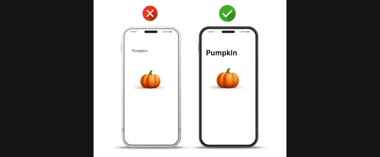
Changing the size of certain elements can help them stand out. Larger elements naturally catch the eye and suggest that they’re important. For example, making a title or heading bigger, like “Pumpkin” in a grocery app, helps users quickly understand the main focus of the page.
Contrast
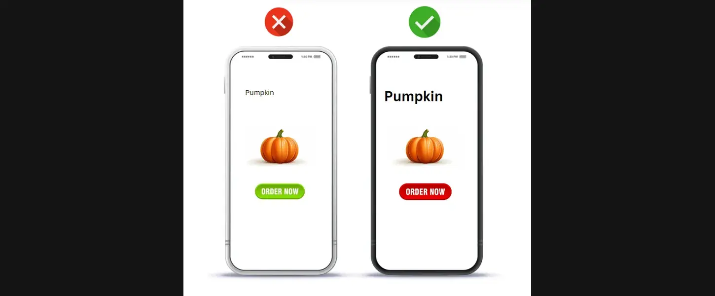
Contrast means making elements look different from each other to grab attention. Using contrasting colors, for instance, can make a button or link pop out. In a checkout app, the “Order” button might be bright red to stand out against a mostly gray or white background. Using bolding, underlining, or highlighting to draw attention to important information is another way to employ contrast in text.
Texture
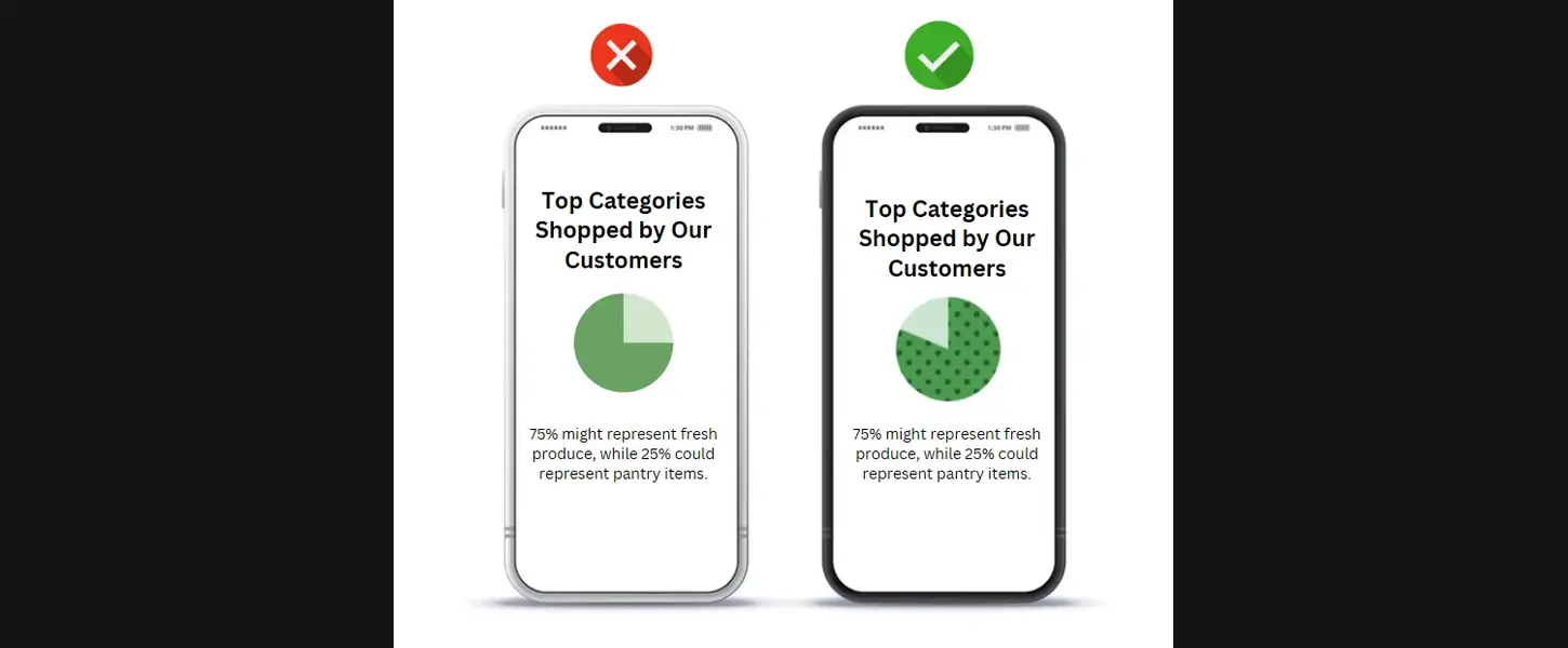
Texture adds depth and helps certain parts of a design stand out. It can make an object look different from the rest of the layout. For example, adding a dotted or patterned section in a chart can emphasize a specific data point. However, it’s best to use texture sparingly—too much can make the design look messy.
Positioning and Layout
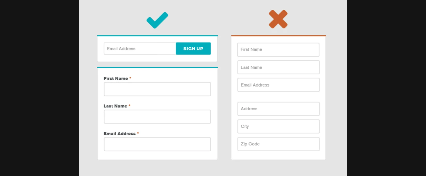
In web design, positioning and layout play a crucial role in guiding user attention and creating a seamless experience. Proper positioning of elements ensures that users can quickly find important information without feeling lost or overwhelmed. When a layout follows a logical flow, users can navigate content intuitively, reducing frustration and making interactions smoother.
White Space
White space, or negative space, is essential in design as it allows elements to stand out and reduces clutter, making the interface more visually appealing and easier to navigate. By surrounding key elements like headlines or buttons with empty space, designers can draw users’ attention naturally without adding extra embellishments. In mockups, this creates a cleaner, more focused experience, where users are guided toward the essential actions or information effortlessly.
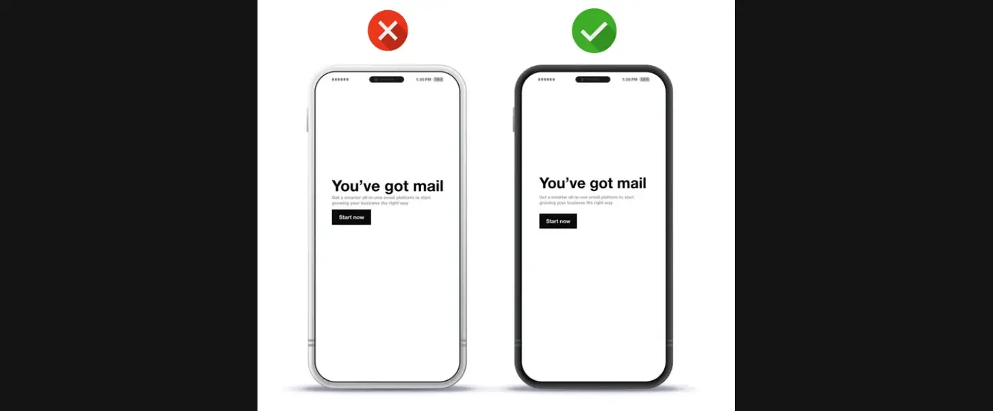
In this image, two smartphone screens display the phrase “You’ve got mail” with a “Start now” button below. The screen on the left, marked with a red “X,” has minimal space around the text, making it feel cramped and harder to read. On the right, marked with a green checkmark, there is ample white space around the text and button, creating a balanced layout that emphasizes the main message and encourages interaction with the “Start now” button. This use of white space enhances readability and draws attention to the call-to-action, improving the overall user experience.
In summary, using emphasis in mockups is essential for creating designs that are visually appealing, intuitive, and easy to navigate. Techniques like adjusting size, contrast, texture, positioning, and white space help guide user attention naturally to the most important elements, enhancing the user experience. By strategically applying these principles, designers can ensure that key actions or information stand out, allowing users to engage effortlessly with the design. Emphasis transforms mockups from simple layouts into effective, user-centered experiences that feel clear and inviting. With these tools, you’re ready to make designs that not only look great but also guide users seamlessly.
By using these simple techniques, you can make your mockups more user-friendly and help users understand the key parts of your design without confusion.

Congratulations, you made it! Now you’re armed with ideas to create standout mockups that guide your users—go make your designs shine!
Further Reading
Google UX Design Course — For in-depth learning on UX design fundamentals.
Emphasis: Setting up the Focal Point of Your Design by Interaction Design Foundation — This article explores the mechanics behind guiding user attention through emphasis.
Share Your Thoughts!
Have you tried any of these emphasis techniques in your own designs? Which one made the biggest difference for you? I’d love to hear your experiences! Let me know in the comments which techniques you find most effective for guiding user attention, or if you have any other tips to share. Let’s learn and grow together as we make our designs shine!

